
Analysis of a Collection
Tim Van Steenbergen SS/23

The Project
For my Fashion History class, I was asked to analyze a runway collection of my choosing for external references and choose three key looks and identify key features and historical silhouettes.

Skills Used
-
This collection has little to no documentation other than a listing on firstview.com. I was able to dive deep to find other articles and pieces pertaining to the collection and designer.
-
Because of how niche this collection was, I had to be genuinely curious and invoking.
-
A large portion of the analysis is identifying key pieces and garment references of three main looks.
-
While the main reference is of the film “Death in Venice”, the collection also references pop culture of the early 2000s as well as political environment.
-
An analysis of this length can often become cumbersome to the reader so I had to ensure enjoyment and intrigue for the reader.
-
The three looks I chose to analyze further were completely up to me and were dependent on what I thought best represented the collection.

Influence
Death in Venice (1971)
Van Steenbergen’s intention with this collection was to translate the emotional and visual tone of Death in Venice (1971) into clothing that maintained theatrical resonance without compromising wearability. The film, adapted from Thomas Mann’s novella, deals with aging, unspoken longing, and the haunting beauty of youth, all set against the backdrop of a cholera-stricken Venice. Van Steenbergen channels these themes through garments that feel ghostly and intimate. The lightness of the fabrics such as silks, cottons, and sheer crepe, suggests impermanence and emotional transparency. The use of drapery, asymmetry, and soft tailoring references classical and Edwardian dress, echoing the time period of the film without veering into costume.


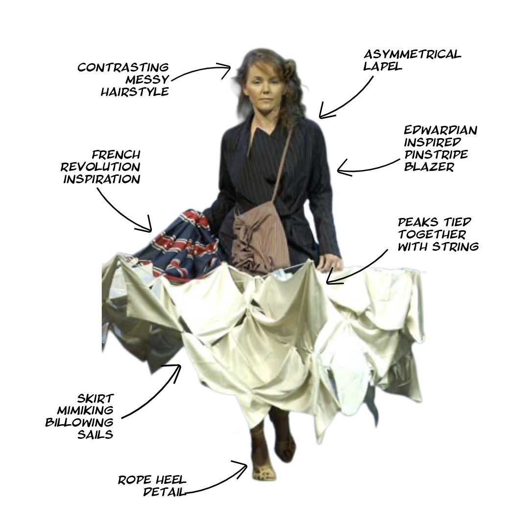
Look 1
This look showcases how Van Steenbergen combines avant garde with historical reference. Here he blurs the line between wearable art and clothing, evoking the Venetian setting of the film with its billowing, almost water-like appearance.

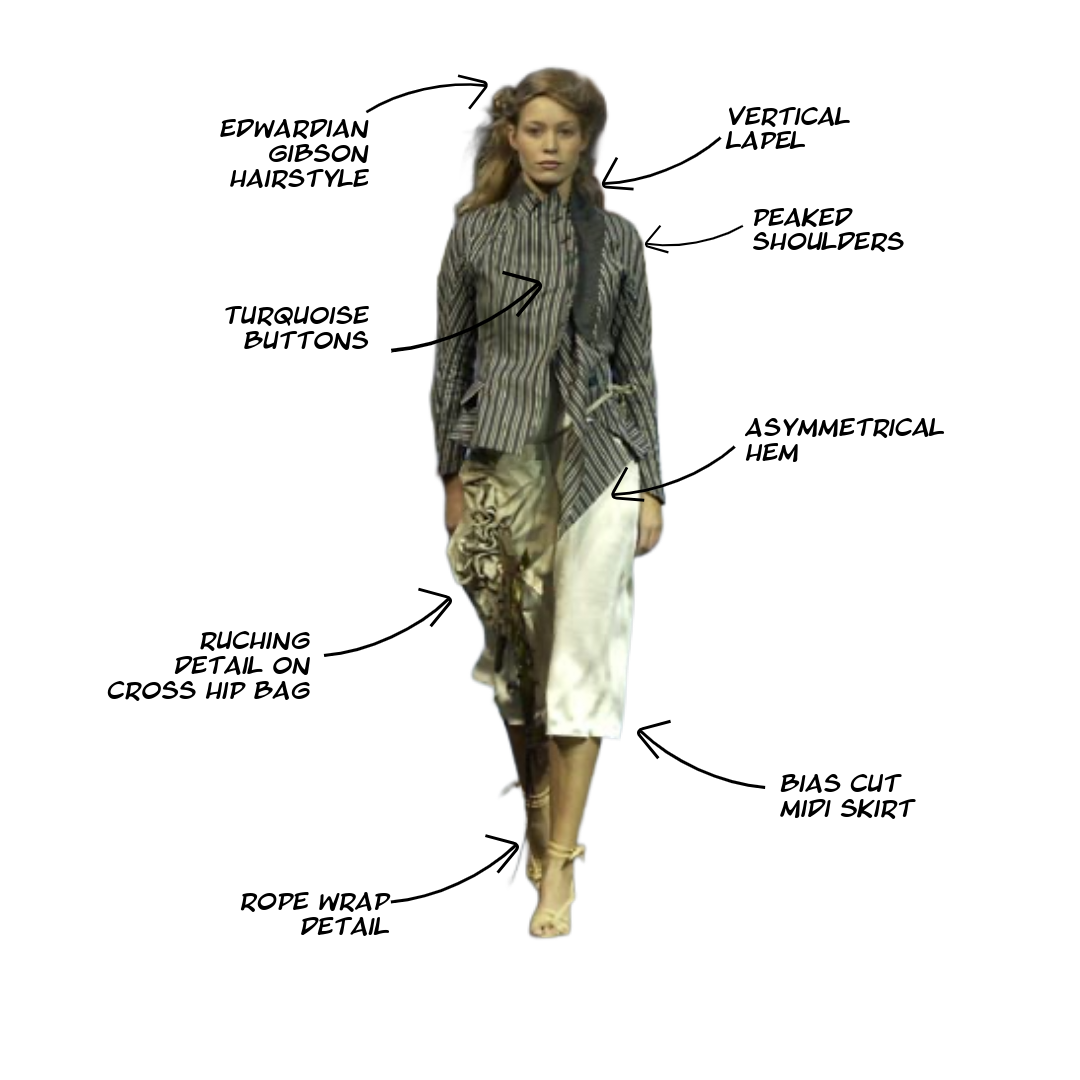
Look 2
Following the theme of the freedom of the sea, this look visually represents what would happen if the model walked into the water. The look embodied the push and pull between control and emotional release, a central theme in both the film and the collection.

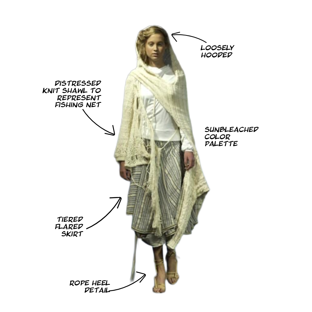
Look 3
Through the delicate drapery and soft colors, this look captures the collection’s themes of fragility, nostalgia, and historical romanticism. Van Steenbergen plays with themes of contrasting softness and rigidity through contrasting garments such as the skirt and shawl in this look.
About the designer
Tim Van Steenbergen was born in Belgium and trained at the Royal Academy of Fine Arts in Antwerp, graduating with a focus on fashion design and theatre costuming. Before launching his own label in 2001, he worked under Olivier Theyskens, another Belgian designer known for dark romanticism and conceptual elegance. Steenbergen’s background in costume design informs his Spring/Summer 2003 collection deeply, particularly in the way garments convey character and narrative. Rather than simply dressing the body, he sculpts emotion through fabric, engaging in a dialogue between past and present.